
Brand Identity
XHALE CONSTRUCTION
A bold construction identity designed for recognition across digital, print and field applications.
Project facts
The brief in plain terms.
- Client
- XHALE Construction
- Work
- Brand Identity
- Market
- North Carolina
- Studio
- SS Design Media
- Industry
- Construction
The challenge
Build an identity that can hold up in the field.
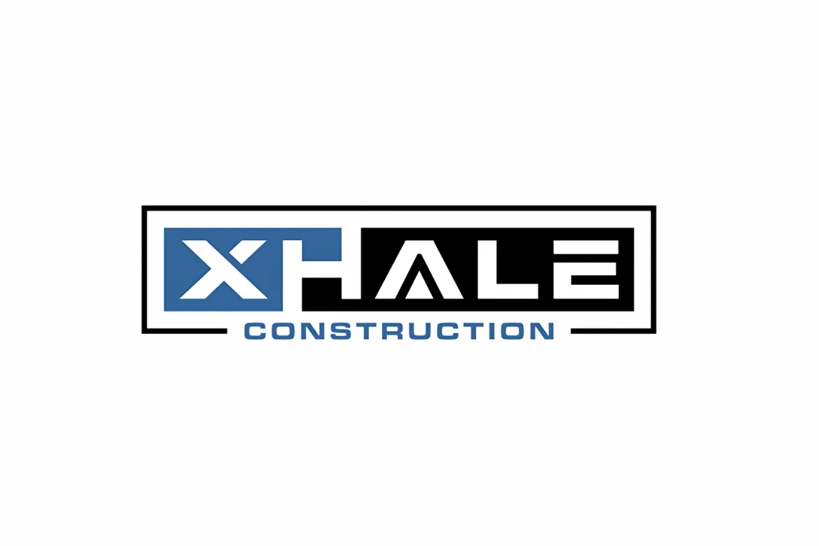
XHALE needed a construction identity that felt strong enough for field use while staying clean enough for websites, estimates, apparel and digital marketing.
The strategy
A practical identity system, not a decorative exercise.
The identity direction centers on a bold geometric mark, modern typography and practical contrast. Construction branding has to survive environments where the logo may be small on a mobile screen one minute and large on a truck, sign or shirt the next. The project prioritizes silhouette, legibility and repeatable application over decorative complexity.
Design direction / design decisions
The details carry the decision.
The direction uses a bold geometric mark, modern typography and practical contrast, prioritising silhouette, legibility and repeatable application over decorative complexity. The identity stays focused on the mark and its rules rather than expanding into website or SEO work.
Identity system / what the work included
Logo, type, colour and applications that hold together.
- 01
Logo system
A mark designed to remain recognizable across sizes.
- 02
Typography
Modern type choices that support a strong construction aesthetic.
- 03
Color & contrast
Practical usage across light, dark and physical applications.
- 04
Field applications
Consideration for vehicles, apparel and jobsite materials.
- 05
Digital application
A system that carries cleanly into future website and social use.
- 06
Brand consistency
Repeatable rules so the identity does not drift.
Identity applications / imagery
The identity in the applications it was built to support.
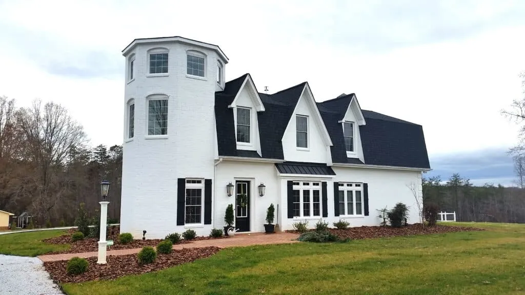
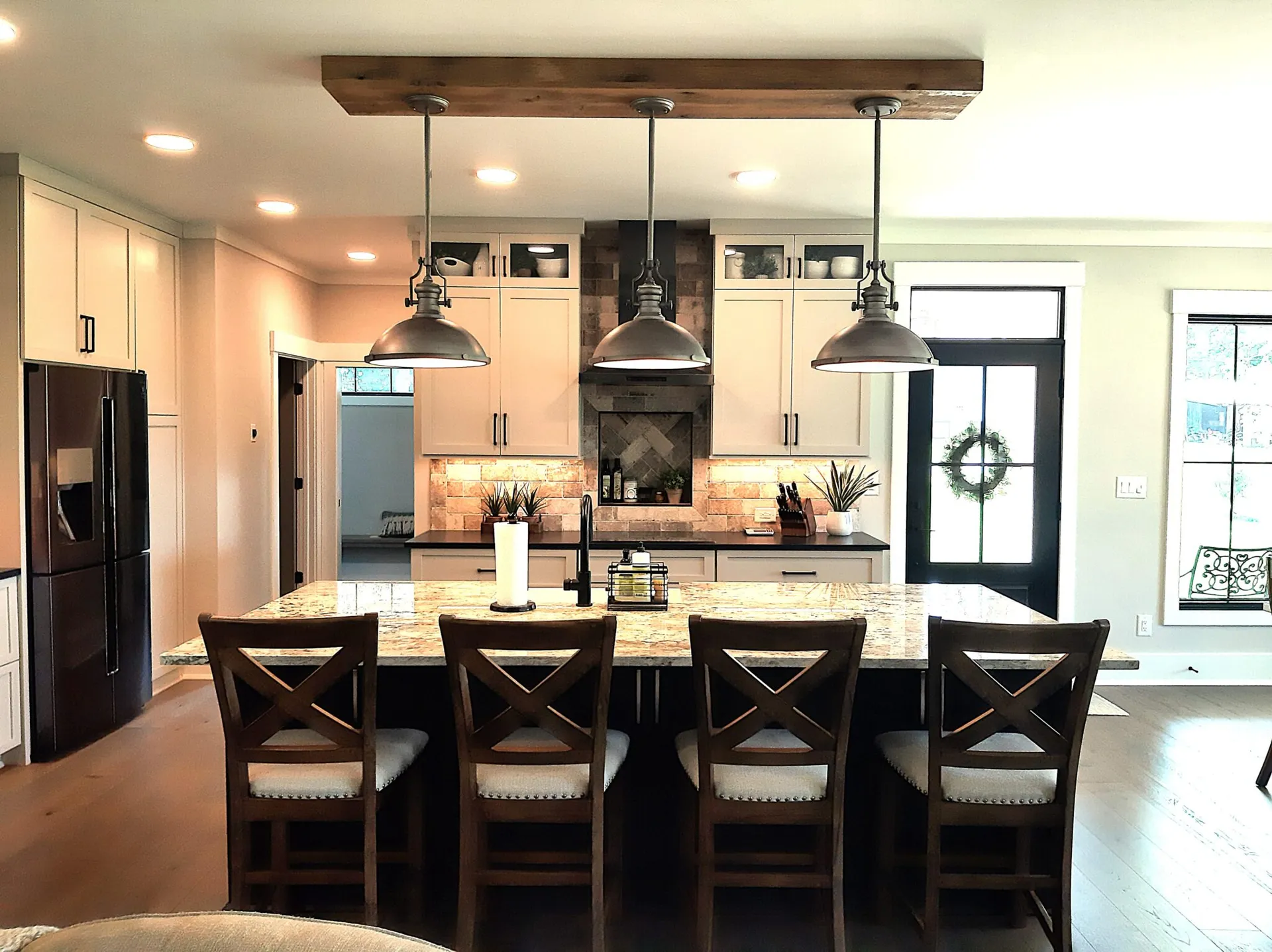
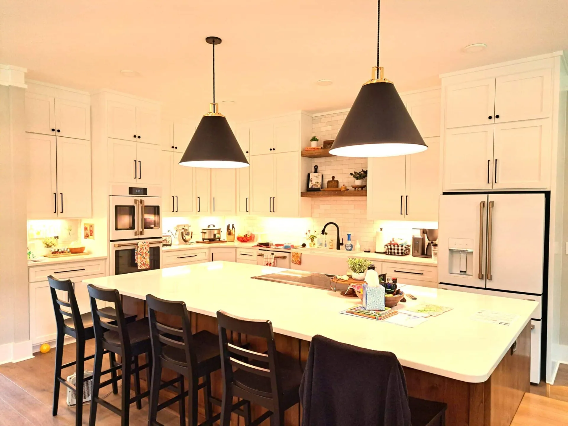
The logo, typography and colour system are shown in the real identity imagery from the project.
The result
Specific outcomes, honest evidence.
A working identity system with a recognizable mark, deliberate typography, practical colour contrast and repeatable applications.
Related services